Szanuj zieleń
Dec. 14th, 2021 11:14 amIntro for English speakers
"Szanuj zieleń" is a Polish expression for which you won't find an English counterpart. It's something you barely ever notice when you live in Poland, it's so common and so forgettable. That's why it took me 4 years abroad to stop and marvel about its meaning when I noticed one. Actually a bunch of them.
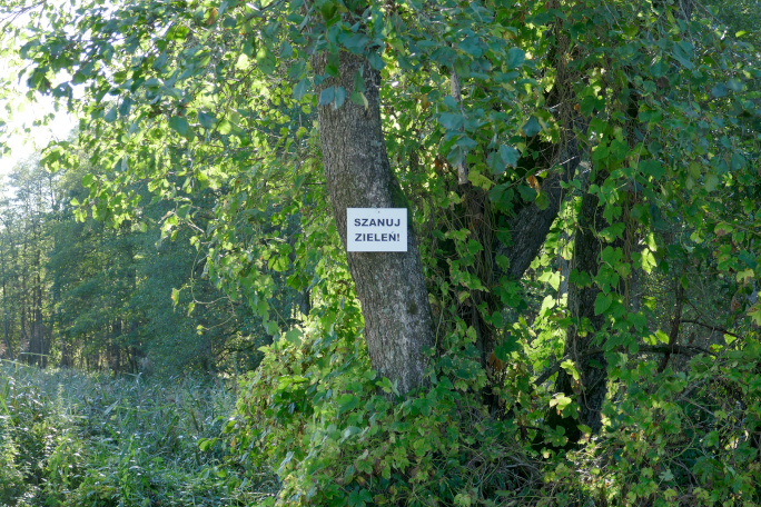
One dictionary provides "keep off the grass", which, while relevant for kids trying to play ball, doesn't seem to apply at all for the stretch of grassy riverside where those were placed. What do they mean then? It's literally "respect the green". Something about plants or nature? Again, it took me until translating this blog post to fully consider the implied meaning. But that's not why I set out to write in the first place. It's because I was fascinated by the presentation of the message.
Respect the green
The signs are put up every 100m along the river. Each sign has a black background with bold black letters on it. An exclamation mark follows.
A monologue like this is made up not just of words, but also of its form. Just like a speaker chooses the place of the speech and the inflection of their voice, a sign designer must dress their words in some context.
What did they have in mind? What mechanism did they foresee to convince the reader to follow the obligation?
"RESPECT THE GREEN!". Imperative mode, made stronger by the exclamation mark. The author puts themselves in a position of power over the reader. They want to impose their will. How are they going to enforce it? Are they trying to let me know that violators will be punished? But they don't present a relevant law – perhaps it's just posturing. Capital letters mean shouting on the internet – shouting is something you resort to when you don't have other means of power.
But capitals can also mean "CAUTION" and "EMERGENCY EXIT", which exist for the reader's benefit and should be easily read. Purely utilitarian. Official. Just like the choice of colours: black letters on a white background. Just like official letters: serious and impersonal.
What emerges is an intention of a serious order, issued by an official authority, for the good of the reader. But when it was hanging above my head, I thought that its threats were empty, and its arrogance made me want to rebel instead. After all, official documents are always signed by the one who issues them. Unless… that someone is pretending to be more important than they really are. For example, by raising their voice, or using vague threats. I don't like people like that.
What if the sign was green-brown, calligraphed or decorated with flowers?
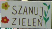
It would be clear from the outset that the needed work was more than just typing in an exclamation mark. It would say: "I care! Mind the nature, because it's important enough for me to put in some effort".
Decorations come from those who have childish or refined tastes. Either way, they are tame and safe. The lack of an exclamation shows it's a request. My first thoughts upon seeing such a sign wouldn't turn to punishment. At most, I could think about the pang of conscience if I made the author sad by ignoring the message.
Floral patterns say "I like plants". After all, how often do we draw things we don't like? Those are the pictures of what we would lose if we didn't follow the request: the only punishment is the loss of flora. "If you don't respect the green, we will lose it."
I think that kind of a sign would make me more careful, and perhaps make me smile too.
So why were the riverside signs of the first kind, and not the second? Perhaps the author lacked resources. It's often better to have something simple and ready, rather than take forever to make something perfect. That would have been the case if communication was easier. A missed message can backfire and make people do the opposite of what's expected. Or perhaps the sign got the correct reaction among the colleagues of the maker. If they were all county clerks, that would have fit the stereotype, with submission to authority.
But maybe making a sign that works wasn't even a goal. The author could not care about nature at all! Could "respect the green" be a ploy, whose real goal is hidden?
The signs could simply be an effect of bureaucracy. The official must simply check off a couple of items to use up the budget, so the official comes up with a sign. Who cares about its effectiveness, especially if it's hard to measure.
I just hope it's just the lack of experience. Therefore:
Dear official! Next time, please design signs that are a pleasure to look at!